First Round of Styling!
- Chuck Curtis

- Aug 15, 2019
- 3 min read
I've got the basic functionality of dealing with Groups covered. The user can create a new group, view a single group or all the groups, update/edit a group, and delete a group. I'm feeling good and decide it's a good time to do some basic styling so I don't have to look at the basic HTML anymore.
I'm using a mobile first approach to style. The screenshots that you'll see are as the app would appear on an iPhone X. I'll add responsive design down the line, but for now I'll only be styling with the mobile view in mind.
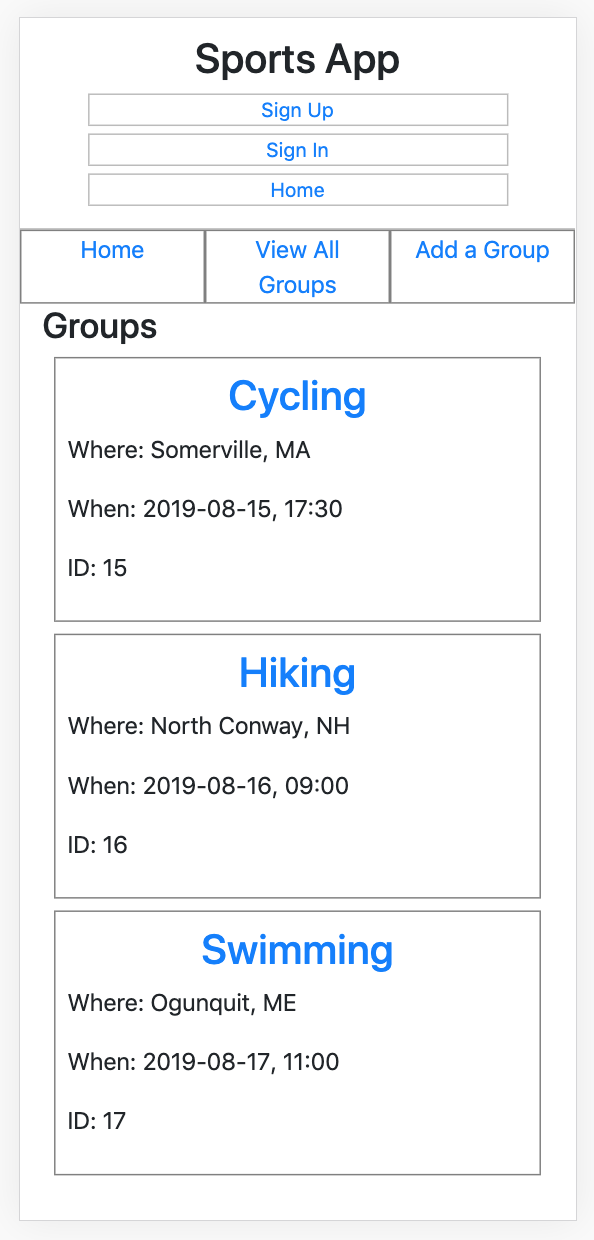
I start with some basic layout for the group nav bar. Since I'm using Boostrap for the sidebar, I give each item the className of 'text-center' which centers the text within the element. I also add border of width 1px, solid, grey for now, just to distinguish the elements from each other. I'll revisit the navbar styling later.
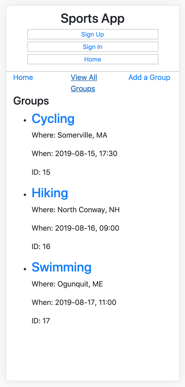
Looking at the Groups component, I have a 'Groups' header followed by an un-ordered list. Each list item contains a group. Each group starts with a header which is the name of the sport and doubles as a link to the individual Group component. Under the header is the listing of the location, followed by the date and time, followed by the ID. I'll be taking out the ID later on but I'm leaving it in as I continue to build and add features.
Since I'm adding styling to the Groups component, I create a new Groups.scss file in the group-components folder. Creating a new file here will help keep my style sheets organized. I make sure this new file is imported into the Groups component so that the styles are applied.

Moving into the new file, I start with updating the list-style in the groups-list to none. This will remove the bullet points from the list items. I also want to center the list items, and since the unordered list tag has default 15px padding-left, I remove it by defining a padding of 0 to the list. Then I add the group-list-item class to the file and define a basic border so that I get a better idea of that my list items currently look like on the page. I feel like the list items are crowded together, so I add a margin of 8px. I also don’t like how the text is right up against the border, so I add padding of 8px as well. I decide that I want to center the header text/link within each group item, so I add the h3 and apply a text alignment of center. I realize I also want the Group header for the entire list to be centered, so I decide to give the h2 and h2 elements both a centered text alignment.
Next, I want to increase the font-size for the p elements, so I make the 1.2 rem to fill out the screen a bit more. I also look back at the sidebar and decide to update the names of the links to make then a little shorter and more consistent.
Now I want to add color to only the links within the list. First I define the color variables for link-color and link-hover, and then I reference the a tags inside the group-list tag and set the color to the appropriate variable.
I decide I also want to color all the h2 tags, so I define a new variable for page-header color and then set h2 color to the new variable. Now, each page header is the orange color. I also give the h2 elements a top margin of 24px to give them a little breathing room after the nav bar.
Speaking of the nav bar, I want to add some new color to these links also, but use a different color from the links in the list. I go to the navbar style sheet and update the link tags to have a green color along with a lighter green color on hover. I also increase the font-size to 1.2 rem and bold the text to make it stand out on the page.
At this point I'm satisfied with the look of the Groups component, but when I select a list item and see the individual Group component I don't like how it's looking. I import the new file into the Group component and then increase the font-size of the p element in the group-component class to 1.2 rem so that it matches the Groups component. I also add a margin of 16px under the h2 element to add some space between the content and the header.
Naturally I still have a ton of styling left to do, but for now I'm satisfied with the layout of the components. It'll be nice to continue to develop in an app thats starting to feel like an app, instead of just a bunch of vanilla HTML on the screen!


Comments